David Carson
- Solar Chin
- Oct 11, 2023
- 2 min read

Updated: Nov 21, 2023

David Carson, born on 4 September 1954, was an American contemporary graphic designer during the 1990s. He revolutionised the graphics design scene in the 90s with his artistic typography style.
Carson graduated with a Bachelors Degree in Fine Arts and attended Oregon College of Commercial Art; his other talents included professional surfing at which he peaked 9th for best surfer in the world for.

His work is characterised for chaotic typography and the disarray of layers that the text creates for the larger overall image. The typography imitates that of an artists brush strokes in replacement of letters and numbers.
In this image that we studied, you can see that Carson used letters and numbers do to just that: characterising his wrinkles and lines and eyebags with '1's and his eyebrow expressions with 'J's.
I'm not the biggest fan of his art style as I found it unaesthetically pleasing to the eye and creating my own inspired piece was more difficult than expected.
His art style is based on creating shapes out of big letters for the overall image which contradicts with my own detailed and precise art style.
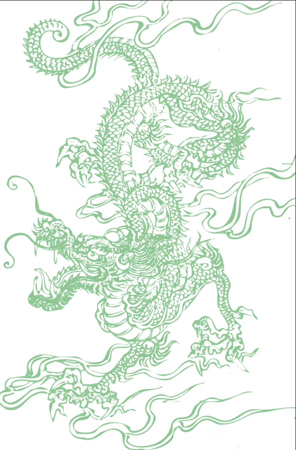
The Chinese mythological dragon I used for the background:
This was the layers of the word Yi Fu in Chinese meaning 'clothes' which makes a literal representation on the art as the clothes are literally 'clothes' in Chinese.


I used a variety of layers that incorporated 'A' and 'O' for the eyes and 'C' and '(' for the hair. I used 'L' for the stylised cheekbones.
To fill in the spaces of hair and create visual 'colour' on the lips, I used Mandarin Chinese, my first language, to include my own culture into the piece of art.
A lot of the words are 'butterfly' which is my favourite animal, the repetition of the word is my attempt to create a similarity to my repetition of human hair.
I also included lines from my favourite character in a game I play that has themes to do with death and rebirth -both words included.
In conclusion, I think the overall piece is alright. I definitely could've used more layers to make the tones darker and I could've been more imaginative with the characters used as most of them were copy and pasted same ones. I used the '(' a lot whereas the original piece uses more variation in strokes and lettering. I suppose you can still recognise the original image from the artpiece but it was a shame that the details in clothing were lost in the simplicity of the artstyle that I wish I could've retained.


Comments